-->

Saturday, October 19, 2013

All for Nothing!

You may have seen my previous post regarding my one year anniversary blow out sale.  Well…I am feeling crazy generous today as I have come to a realization!

One…I have been providing tuts and free materials and freebies since 2010.  That is three years worth of fun play time and materials to help you grow your design business. I have had such a time trying to keep up with things since I started my new job a year ago. Things are starting to settle down and I now come to a crossroad where I say….

Two…I plan to add new tutorials and will be offering new materials, methods, freebies, etc.  So….

Out with the old and in with the NEW! 

I am offering the original One Year Anniversary Package absolutely FREE!

That’s right ladies and gents…no need to put on your glasses….you read that correctly…..FREE! 

One Year Anniversary Blowout FREEBIE! 


Advertisement-Freebie

Included in the package are:

Candy Wrapping:

1 Paint Can Set, 2 Sets SOE Sized Overlays, 7 Sets of SOE Sized Papers, and 4 SOE Sets

Designer Tools:

2 PSP Brush Sets, 2 Color Pallet Packages, 3 PSP Shapes Sets

Digital Scrapping:

1 Full Size Kit, 3 Micro Kits, 18 Papers, 1 Quick Page

PSP Scripts:

71 Scripts!  Some never made it to the blog!


LOTS of goodies in this bag! A total resale value of $200.00.

Am I crazy?  Quite possibly!  So take advantage of my temporary insanity and grab this package for  FREE!! 

Click on the link below to download the package. 

Thank you for helping me celebrate this once blogging milestone and making room for new materials!

**NOTE – Not all files will be supported due to the number of files, age of the files and the amount of time it takes to modify them. But always ask…if time permits I will see what I can do! **

Get it HERE!

Friday, October 18, 2013

Merging Images with Paint Shop Pro

It has been a long while since I’ve written a tutorial…and it is LONG overdue! This tutorial was inspired by Marie who wanted to add a graphic to a photo.  She did a great job, unfortunately she lost her background which would have rounded out the picture.  This tutorial was written using PSP X but will work in older and newer versions as well.  I have PSP 9 through X5 (have had X5 for almost a year and haven’t installed it yet!)  There are different ways to do this using X4 and up so another tutorial for that will follow a little later. 

Tools you will need:

Paint Shop Pro and an Imagination

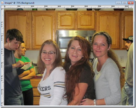
Step 1 – Open the image you will be working on.  For this tutorial I am using a picture of me and my sisters at Thanksgiving last year.

Step 2 – Go to Window and then select Duplicate.  Then close the ORIGINAL image.  I highly advise this step so that you do not inadvertently make permanent changes to the original image.

Now here is what we should have
image

Don’t we look happy? LOL

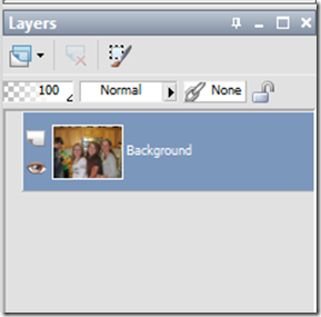
Our pallet layer should look like this:
image

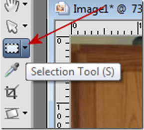
Step 3 – Click on your Selection Tool:
image

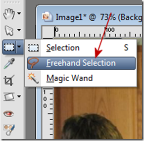
And click on Freehand Selection

image

Step 4 – A Lasso will appear….Starting at the bottom edge of the image, select the area that you want to KEEP using small segments to connect. The smaller segments are going to help keep your rounded portions more realistic and help eliminate jagged edges.

Using small clicks with the left button on your mouse…we are starting to see an outline form on the left hand side.
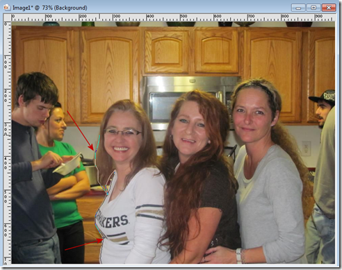
image

Here is a zoomed in image of the line starting to form
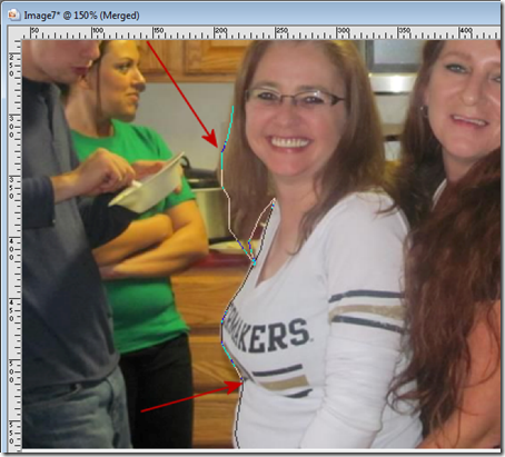
image

Continue outlining the portion of the image that you want to keep. Be sure to continue back to your starting point to make the final connection.  Once the final connection has been made, right click with your mouse and the “marching ants” will appear around the portion you want to keep.
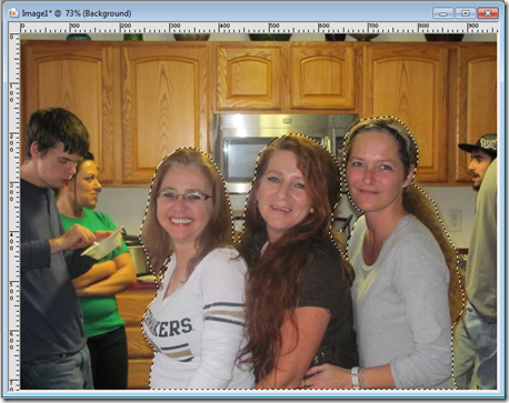
image

Step 5 – Go to your layers pallet and right click on the layer labeled background.  Select Promote Selection to Layer
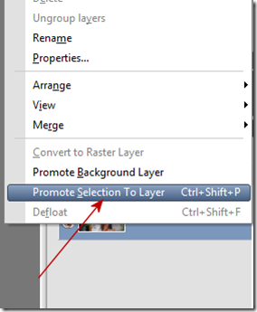
image

Your layers pallet should now look like this:
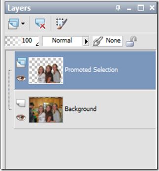
image

Step 6 – Go to Selections then Select None.

Step 7 – Click on the eye next to the layer labeled background to make that layer invisible.  This is what our image looks like now.
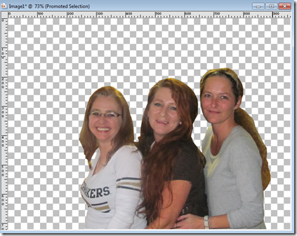
image

Now here is where the REAL fun begins! 

For this tutorial I am going to invite someone to dinner…opening a SECOND photo (of our mystery guest) and using the photo of them, I am going to repeat the process using the freehand selection to outline their image.  Once I have them outlined, and the marching ants are around them…..we will go to Edit and then Copy……And then we will make our picture of us girls together as the “active image” by clicking on it. We will then click on the layer labeled “background” to make it the active layer (still invisible) and then go to Edit and then Paste as a New Layer.

Here is what our layer pallet now looks like:
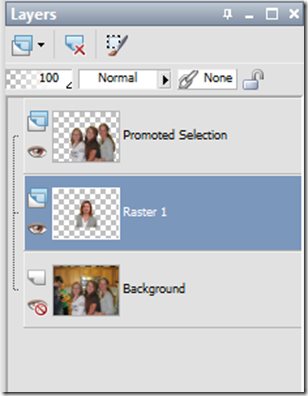
image

And who did we invite to dinner??? Here is our image so far:
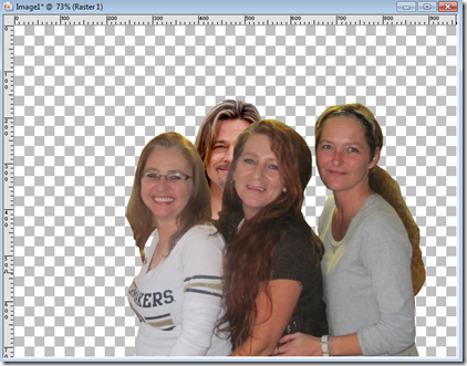
image

Who is it? Can you tell yet?  They are hidden back there somewhere behind my sister!  So We will click on the layer labeled Raster 1 to make it the “active” layer.  Then go to the Pick tool and select “Pick”  For PSP 9 and earlier this will be the Raster Deform Tool.
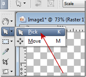
image

Ok….now our mystery guest is selected and we will place our mouse in the center of the mystery guest layer
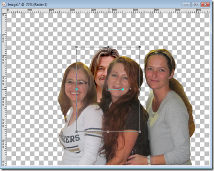
image

and using our left mouse button we will (drag) move them up so they are more visible.

Our image will look like this as we are moving them:

image

Once you have them where you want them…..let go of the mouse.  Here is what we now have:
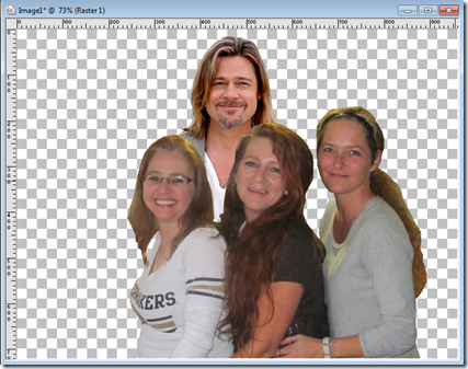
image

That’s right ladies….who hasn’t dreamt of having Thanksgiving dinner (or any other dinner) with Brad Pitt?  LOL 

Now….let’s invite the family back…..

Click on the eye next to the bottom layer labeled background to make it visible again.  And here is our final image:
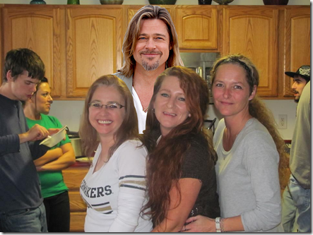
image

Gobble! Gobble!  And it’s a VERY Happy Thanksgiving!  LOL

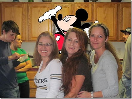
Marie wanted to add a clipart image (graphic) to a photo.  So here is a sample using a graphic clipart:
image

Ok…so Mickey is no Brad Pitt…but I dare ask….who hasn’t wanted to have dinner with Mickey too?!

With most of your clipart…they may already be saved in a transparent PNG format.  This is a time saver for you since you will not have to trace their image and copy, simply copy the transparent image and paste it as a new layer.  If it has a white background or a colored background you will need to make it transparent.  The best way is to export the image as a PNG image and be sure to select transparency and select the color of the background to make it transparent…then you can open the new transparent image and copy and paste as a new layer.

I hope you found this tutorial to be helpful.  I know I found it to be entertaining!  It is late…and I need to go to bed…and will be dreaming of Brad Pitt at Thanksgiving dinner.  Hey…one can wish can’t they?!

I look forward to seeing your photo mash ups using this technique…..happy creating!

Thursday, March 29, 2012

Tutorial Writer’s Inc

Just a note to let all of you know that my tutorials are now protected by Tutorial Writer’s Inc. and you will need to follow closely my TOU for use of my tutorials on your shared sites.  Please look to the right and click on Terms of Use before you post, copy or translate any of my tutorials.  Thank you for your understanding!

Have a great day!

Rhonda

Tuesday, March 27, 2012

Simple Satin Ruffled Ribbon

So in this tutorial we are going to talk about making a satin ribbon that you can use for any of your graphic design projects. It will work in PSP 8 and up and there are no plug ins required!

Tools you will need: Paint Shop Pro and a desire to learn!

Here we go!

For this tutorial we are going to make a ribbon that is long enough to be used in a gallon paint can design.

Step 1 – Open PSP and go to File/New and use the following settings:

image

Step 2 – Click on your selection tool:

image

Then click on the Custom Selection box on your toolbar:

image

And use the following settings:

image

Step 2 – Pick the flood fill tool and fill the selected area with the color you want.  For this tutorial I am going to use Blue.  And our image will now look like this:

image

Go to Selections/Select None.

Step 3 – Go to Effects/Distortion Effects/Wave and use the following settings:

image

Our image now appears as below:

image

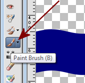
Step 4 – Go to Layers/New Raster Layer and then click OK.  Now select your paint brush tool:

image

And use the following settings for your paint brush:

image

Use the settings you see in the tool bar above and then make sure your Opacity is set to 100; Blend Mode is Normal and Continuous is checked.

Now change your foreground color in your materials pallet to black and make paint strokes on the “downside” of our curves. Our workspace will appear as below:

image

It doesn’t need to be perfect.  Now staying on this layer; change your foreground color to white and paint between the black strokes.  Our image will appear as below:

image

Again, it does not need to be perfect. 

Step 5 – With the painted layer as our active layer go to Adjust/Blur/Gaussian Blur and use the following settings:

image

Click OK and our image will now appear as below:

image

Now Double Click the layer that has your paint strokes on it and change the opacity to 60. See below:

image

You can change this to 50 if you are working with a lighter color and want the shading to be slightly lighter than the current shading.

Step 6 – Click on the layer that contains the ribbon to make it the active layer.  Now go to Selections/Select All and then Selections/Float/  and then Selections/Defloat then go to Selections/Invert.

Make the painted layer your active layer by clicking on it and then simply press your Del key and then go to Selections/Select None.  This will eliminate the excess paint we got on our workspace earlier. And our image will now appear as below:

image

Step 7 – Go to Layers/Merge/Merge Down.  Now we have one layer to work on.  Go to Effects/3D Effects/Drop Shadow and use the following settings:

image

Again, you can play with this to your liking.

Now, you have a finished satin looking ribbon you can use on your projects.  If you want to make this into a border…..proceed to the next step.

Step 8 – Go to your selection tool and then click on the custom selection box and use the following settings:

image

Our image will appear as below:

image

Now, simply press your Del key and then go to Selections/None and you have a border.

image

Now you can go to Edit/Copy and then Edit/Paste As A New Image and you will have saved file size by having an image that is only the size of our ribbon.  I would suggest that you convert this to grayscale for future use. To do so: go to Image/Grayscale and then Image/Increase Color Depth and select 8bit Channel. Save the file as a PNG for future use on your paint can projects and then you can simply copy and paste it to your paint can and then use the Adjust/Manual Color Correction tool.

It works well with patterns too! 

image

Have fun! I look forward to your creations!

Simple Two Toned Plaid SOE

So for this tutorial we are going to use the grayscale plaid in our previous tutorial: Easy Two-Tone Plaid and make various two toned plaid SOE backgrounds.  This is so easy you are going to be ecstatic!

This tutorial will work in Paint Shop Pro 8 and up.

Let’s rock and roll!


Step 1 – Open PSP and Go to File/New and use the following settings:

image

Step 2 – Using your flood fill tool; fill the empty layer with the color you want as your plaid color.

image

For this tutorial I am using pink. Here is what my layer pallet looks like:

image

And this is what my image looks like:

image

Step 2 – Go to Layers/New Raster Layer.  Then click on your foreground color picker in your materials pallet.  It looks like this:

image

Now select the Patterns tab and then find the Grayscale pattern we made previously.

image


Step 3 – Select your Flood Fill Tool again and fill the new raster layer with the pattern.  Our image will now appear as below:

image

And our layer pallet looks like this:

image

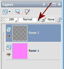
Step 4 – Select the Blend Mode drop down button above raster 2. It looks like this:

image

Select the option Overlay.  And our image now appears as below:

image

Cool huh?  Now we can make as many plaid SOE sized backgrounds that are two toned as we want.  All we have to do is flood fill Raster 1 with a different color.  Save this as a template so each time you need a two toned plaid SOE you can just pull up this file and flood fill Raster 1 with a new color quickly and easily!  Here are a few more samples:

image

image


OK….so the other method is even more simple.  You create your new image using the settings we’ve used in this one.  Then flood fill the area with the plaid pattern.  Simply use the Adjust/Manual Color Correction and change the plaid color to something different.  We used these steps in the previous Easy Two-Tone Plaids tutorial.  Either way you do it be sure to save it as a template for future use. If you are using the adjust method….I suggest you flood fill the area with the plaid layer….then save as your template then go to Window/Duplicate and make any color adjustments there so that you do not change the original permanently.


I hope you have fun with this tut!  I look forward to seeing what you all make!