-->

Monday, March 14, 2011

Creating Textboxes/Frames in PSP – Part 3

OK, thus far in this textbox series I have shown you how to create a basic textbox using the shapes tool, how to create a textbox using your line styles as well as how to create your own line style. This section will focus on creating textboxes with actual text!  For this tutorial we will talk about the following:

1. Creating a word art textbox using the text to path option.

2. Creating a word art textbox using the reverse text to path option.

This tutorial was written using Corel Paint Shop Pro X but will work in earlier versions as well as newer versions.

And here we go!

TEXT TO PATH

Step 1 – Create a new image using the same settings as the previous two textbox tutorials.

image

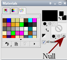
Step 2 – We will be creating a textbox with an outer edge only and no interior fill. Set your Foreground color to the color of your choice for the outside border and set your Background color to Null.  For this tutorial I am going to keep the black outline.  See below:

image

Step 3 – Select the Shape Tool and use the Rectangle setting.

image

At the top you will see the shape options on the toolbar.  Use the following settings:

Mode: Draw Rectangle

image

Create On Vector : Checked

Horizontal Radius:  45.00

Vertical Radius:  45.00

Line Style:  Solid

Width: 10

Anti-alias: Checked

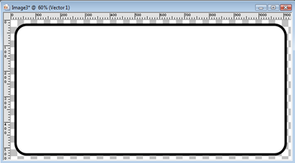
Starting at the top left corner, click your left mouse button then drag to the bottom right hand corner.  Release your mouse button when you have reached the location where you want your shape to stop. Your image will appear as below.

image

Step 4 – We will resize our canvas so that our text can fit around the outer edge of the textbox.  Go to Image/Canvas Size and change the settings to add 200 pixels to the top and the bottom.  Be sure to select the Center button in the Placement area to place your original textbox in the center of the newly sized canvas.  See below.

image

Step 5 – Make the Raster 1 layer the active layer by clicking on it. Then return to your Material Pallet and click OFF the transparency option for your background color.  Change this color to whatever color you want for your text. For this tutorial I am keeping it at black to make it easier to see.

Step 6 – Select your Text tool.

image

And place your cursor at the center of the top line of your rectangle. You will see a Text Tool with a semi-circle under it.  Then click to select the line area as your placement and then start typing what you want to use as your word art.  For this tutorial I am just going to use the words Happy Birthday. 

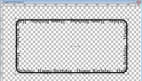
Your word art will start to conform to the shape of the rectangle we created earlier. Once you have all the text entered, click Apply and this is what your word art should now appear as:  (will vary depending on the text size, color, and font that you selected)

image

Step 7 – Click on the eye next to the Vector 1 layer and your image now appears as below:

image

Viola!  You just created a word art frame that will fit nicely as a textbox. Now we are going to move on to Reverse Text to Path. Make sure the Vector 2 layer is selected as the active layer and go to Objects/Properties and give this word art a name.  Then go to File/Export/Custom Shape.  Name it the same as you did under the properties and the word art will now be available to you as a preset shape anytime you need it.

REVERSE TEXT TO PATH

Now, using the same rectangle we made earlier, we are going to reverse our text path.

Step 1 – We will first click on the eye next to the Vector 2 layer to make it invisible.  Then click on the Vector 1 layer to make it the active layer and click the eye to make it visible. Then select your Pick Tool (Raster Deform for PSP 9 and below) Click on the center of the canvas and then right click and select Convert To Path.

image 

Step 2 – Click on the Pen Tool and then go to Object/Edit/Reverse Path.

image

Step 3 – Repeat steps 5 and six above. Your text will reverse the path and appear as below. (will vary depending on the text you are adding)

image

Now if we click on the eye next to Vector 1 again, we lose the line and have only the word art left.

image

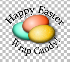
Now you have learned two different ways to add text to a path.  The reverse path may look funny for this rectangle, but it comes in extremely handy when you are using it for circles.  Below is an example of using this combination of the top lettering being the Text to Path and the bottom lettering being the Reverse Text to Path on a circle shape.

image

To accomplish this, I create a circle shape using the Shape Tool. I complete the text to path at the top by completing steps 5 – 6 used in the first part of this tutorial.  Then I make the Vector 1 layer the active layer and go to Edit/Copy.  Then go to Layers/New Vector Layer.  Then go to Edit/Paste as a New Vector Selection and place the new circle on top of the first circle. Then I repeat the necessary steps above to reverse the path for the newly created vector selection. Then I click the eye of Vector 1 layer to make it invisible. And click the Vector 1 layer to make it the Active Layer.  Then I go to Layers/New Raster Layer. And then select the Text Tool to start my text at the bottom of the shape. Once I have the text the way I want it, I select the layer with the newly created circle shape selection and using the Pick Tool (Raster Deform tool for PSP9 and earlier)  I move the circle shape up until the text looks the way I want it to.

So there ya’ have it.  Two Text to Path options for you to use to create custom textboxes as word art, or word art on any shape.  We have two more tutorials coming for the custom textboxes series. Be keeping your eye out for them. I hope you enjoyed this tutorial and look forward to seeing all of your creations! 

Wednesday, March 2, 2011

Creating Texboxes/Frames in PSP – Part 2

In the previous tutorial I showed you how to make a basic text box using the rectangle shape tool with a solid line.  In this tutorial I will show you how to make textboxes using different line styles.  And we will cover making your own line design to create unique, one of a kind, textboxes.

Tools we will use:  Shapes Tool, Material Pallet, Styled Line Editor

Step 1 – We are going to create a new image using the same settings as Part 1.

image

Step 2 – We will be creating a textbox with an outer edge only and no interior fill. Set your Foreground color to the color of your choice for the outside border and set your Background color to Null.  For this tutorial I am going to keep the black outline.  See below:

image

Step 3 – Select the Shape Tool and use the Rectangle setting.

image

We will use the same settings for the rounded rectangle as we used in the previous tutorial except this time we will use a different line setting instead of solid and we will change our width to 8 instead of 10.

Mode:  Draw Rectangle

image

Create On Vector : Checked

Horizontal Radius:  45.00

Vertical Radius:  45.00

Line Style:  Dash Dot (use the drop down menu next to the line style to select a new line style option)

image

Width: 8

Anti-alias: Checked

Starting at the top left corner, click your left mouse button then drag to the bottom right hand corner.  Release your mouse button when you have reached the location where you want your shape to stop. Your image will appear as below.

image

Below are some samples using different line styles and sizes.

Arrowhead – Ball:  Size 3

image

Barbed Wire: Size 4

image

Diamond:  Size 18

image

Practice this with the different line settings and widths to achieve a different look.  Playing with this will get you more comfortable with the using the rectangle shape tool and the options available.

Now we are going to walk through how to create your own unique line style.

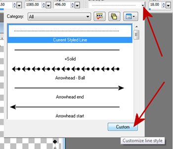
Step 1 -  Repeat steps 1 – 3 above but do not use a preset line style.  Instead we will set all of our settings as before but then click on the drop down arrow next to the line style and at the bottom click on Custom.

image

The Styled Line Editor will appear

image

For this tutorial we are going to create a line that has a fleur and a ball.  To make a continuous line without differences in the beginning and end we will need to set our First Cap and our Last Cap to Flat.  Since they are already set to Flat by default, we do not need to change either of these settings. Instead we will change our different segment caps to create our new line.  If it is not already set to flat for some reason, click on the drop down arrow next to the First Cap style and select the Flat cap option.

image

Repeat this for the Last Cap.

Step 4 – Place a Check mark in the box titled Different segment Caps.  Then select the drop down box next to Segment Start.  We are going to select the Fleur De Lis Cap as our starting segment.

image

Then click on the Size button to change the size to what we want our cap size to be.  For this tutorial we are going to set the size to 4.  Be sure to place a check mark in the box Link Axes. This will make the height the same as the width.

image

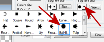
Step 5 – Repeat step 4 as above but using the drop down box next to Segment End to change the end segment. For this tutorial we are going to change the end segment to Ball.

image

Repeat the same steps as above to change the size of the end cap by clicking on the size button next to Segment End design and make sure it is also set to 4 width with the Link Axes checked.

This is what our new line style looks like so far:

image

To change the appearance we will change the Length of the style by clicking on the the up arrows next to the length settings.  For this tutorial we will change this setting to 15.00  Our new line style will appear in the preview window below.  You can play with the length settings to change the appearance of any line that you are creating.  But for this tutorial we will leave it set to 15.00.

image

Step 6 – Once you have the line the way you want it, click on the Save as New Button and give your new line style a name. Then click OK.

Your new line will now appear in the drop down menu for line styles.  I named my line as RDD-FleurBall.  You can see it is now available in the drop down menu:

image

Now you can click on the vector layer to make it active, then click on the Shape Tool to use the drop down menu for the line style and change the style of your previously made textbox to your newly created line style.

I used my new RDD-FleurBall line at a setting of width 5 to achieve the textbox style as shown below:

image

Play with creating new line styles to add your own flair to your text boxes.  The new line style you created can also be used for any vector that you create as it will now be available in the drop down menu for you to select at any time. 

I would love to see the various line styles/textboxes all of you make using the Custom tool in the line style.  You can use anything you like that is available as a cap option and change the size settings to create different effects.  Play with this for awhile.  We will be using more line options in our next textbox tutorial where we will add a unique break in our line to achieve a different effect.

I hope you enjoyed this tutorial and I look forward to seeing all of your new custom line textboxes!
Tuesday, March 1, 2011

Creating Textboxes/Frames in PSP – Part 1

Barb had asked if I could put together a tut on making textbox/frame combinations with lines and text.  Which got me to thinking that I would like to show my readers many different ways to design creative text boxes to use on your candy wrappers or to use as frames for pictures.  So this tutorial will cover the basic text box.  Having an understanding of the basic text box will help you when we begin to work on other methods of making creative text boxes.

This tutorial was written using Corel Paint Shop Pro X but will work in older versions as well as newer versions. 

PSP tools we will be using:  Preset Shape, Materials Pallet

Let’s get started!

THIN LINE BASIC TEXT BOX FILLED INTERIOR

This section will show you how to create a thin edged textbox with a filled interior.

Step 1 – Create a New Image using the following settings:

image

Step 2 – Using your Materials Pallet, select the Foreground color and Background color you want to use. For this tutorial I am creating a basic black and white. Foreground color will be the color of your edging.  Background color will be the color of your interior.

image

Step 3 – Select your Shapes Tool and use the Rectangle.

image

At the top you will see the shape options on the toolbar.  Use the following settings:

Mode: Draw Rectangle

image

Create On Vector : Checked

Horizontal Radius:  45.00

Vertical Radius:  45.00

Line Style:  Solid

Width: 10

Anti-alias: Checked

Starting at the top left corner, click your left mouse button then drag to the bottom right hand corner.  Release your mouse button when you have reached the location where you want your shape to stop. Your image will appear as below.

image

Now you have a basic rounded corner text box with a black outline and a white interior.  Practice this using different colors, patterns or gradients.  To create basic rectangle without rounded edges simply change the horizontal and vertical radius settings to 0 and you will have straight corners.  See below:

image

You can achieve different looks by making your line size larger or smaller in the preset shape options on the toolbar.  If you make one, let us say using 10, and then you decide you want the line larger, simply click on the vector layer that is your box and click on the Shape Tool and the options on the toolbar will appear.  You can change your line width without having to create another box.

THIN LINE BASIC TEXTBOX NO FILL

This section will show you how to create a basic textbox with the line only and no interior fill.

Step 1 – Repeat Step 1 above.

Step 2 – Set your Foreground color to the color of your choice for the outside border and set your Background color to Null.  For this tutorial I am going to keep the black outline.  See below:

image

Step 3 – Repeat Step 3 from above.  Your image should appear as below:

image

Again, you can practice using different colors, patterns or gradients.  Practice with straight edges or rounded edges. Change the width of your line as you would like.  These are the very basics of creating a text box.  It is good to practice often before you try any of the other textboxes that we will be making.

Be sure to try this using different sizes as well such as a 800 x 800 using the square preset shape. Go to Shape Tool – Rectangle – and use the Draw Square Mode instead of Draw Rectangle mode. Square frames are great for scrapbooks or making a specific frame area on a wrapper to put a photo inside.  You can even create a special shape within the textbox itself to add pictures or a verse but we will get into that later in another tutorial. I want you to get the basics down first.

We will cover framing pictures after we have covered the basics and a few creative ideas for textboxes.

Ok.  So this was very basic.  But I thought it would be important to cover the basic textbox from the beginning so that newer users of PSP can gain a grasp on the tools and settings that we will use in the other textbox tutorials.  I hope you enjoyed this basic tutorial and will practice, practice, practice in preparation for the remaining textbox tutorials to come!

Custom Text on a Line

Karen has asked for a tutorial on creating custom text that can be fit above an element.  Text can be curved using shapes.  It can also be created on Bezier curves or straight lines.  For custom elements we will need to draw our own line.  This tutorial will show you how to use the Pen Tool to create a custom line and then how to add the text and finally hiding your custom line from view.

Tools we will use:  Pen Tool, Text Tool

I am using the ribbon Karen was needing the text to which Karen was needing the customization.  You can use any element you want to practice this tutorial.  I would love to see what you guys and gals come up with!

Step 1 – Open your element that you are wanting to create text around. Go to Window/ Duplicate and then close the original file so that no permanent changes will be made to the element.

Step 2 – Set your background color to Null and your foreground color to the color of the line you will create.  Black always makes a great outline option.  We will be hiding this line later so any color will work.  Whatever is easier for you to see is what I suggest. For this tutorial I am using Black.

image

Step 3 – Select your Pen Tool.

image

Change your line settings to the following:

image

Starting at the left side of the element we will draw an outline along the top edge of the ribbon using short strokes.  You will left click for each node section. See Below.

image

Continue following along the top edge of the element until you reach the end.  Then you will right Click and select Apply.

image

Step 4 – Click on the layer that has your element on it to make it the active layer. Then click on the eye to the left to make that layer invisible.  Your layers pallet will look similar to below depending on the element you are using.

image

Your image will appear similar to below depending on the element you are using.

image

Step 5 – Select your Text Tool

image

and place your curser in the center of your element until you see the Text Tool with a semi-circle under it.

Return to your materials pallet and change the background color to active (click OFF the transparency button).  Then set the font size, color, font that you want and begin typing. Continue typing until you have the text you want to appear as you would like it. 

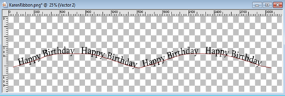
For this tutorial I wanted Happy Birthday to repeat so this is what my text box entry will look like:

image

Once I have clicked Apply this is what my image looks like:

image

Step 6 – Return to your layers pallet and click on the eye next to the Vector 1 layer to make it invisible.  This is what your layers pallet will look like:

image

And your image will appear as below:

image

Step 7 – Return to the layers pallet and click on the eye next to the layer containing your element to make it visible again.  This is what your layers pallet will look like:

image

and your image will appear as below:

image

To make the text appear above my ribbon I will select the layer that has my element on it to make it the active layer.  Then using my Pick Tool (Raster Deform for PSP9 and earlier) I will move the element down. My image will now appear as below:

image

Now we have made a custom line with custom text to fit above our element.  You could even opt to move the ribbon above the text for a different look. Right click on your text layer and select Convert to Raster to add a drop shadow to your text if you would like. You can use this technique to create the text and save just the text as a transparent PNG for use in other projects or to put them together to create a custom element to use in your design projects.  Later I will be posting a tutorial on using Bezier curves and Text on Shapes as we progress into the more intermediate tutorials.  Look for those in the coming months.

I hope you enjoyed this tutorial and I look forward to seeing your creations!